NotionNext博客定制历程
type
Post
date
Jul 14, 2023
summary
本篇主要记录一些NotionNext博客的定制化参数、特性修改等更新步骤,让博客更具个性化,更符合自己的要求。如果网站有什么奇怪的地方,一定是这里出了问题~ 内容持续更新中
category
实践技巧
tags
博客搭建
password
URL
Property
Mar 1, 2024 03:27 PM
一、博客项目地址
二、内部参数修改
1、修改网站图标和作者头像
图标文件路径:
NotionNext/public/favicon.ico头像文件路径:
NotionNext/public/avatar.png2、hexo 主题修改首页显示分类大图标, 问候语等
文件路径:
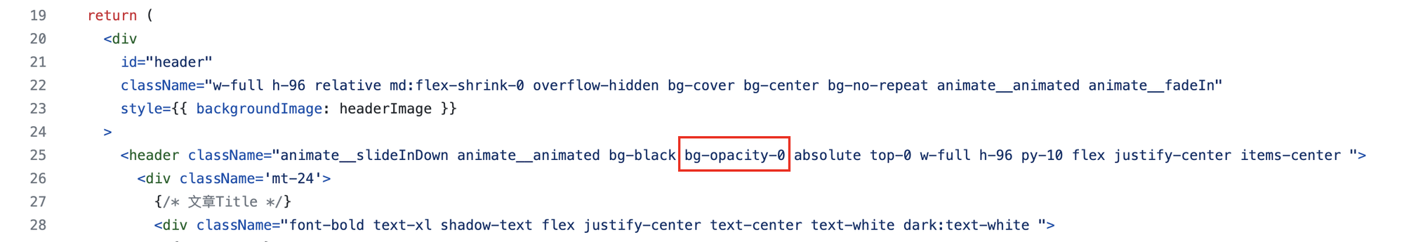
NotionNext/themes/hexo/config_hexo.js3、hexo主题自建page页面和文章页面的大图修改遮罩的颜色深浅
文件路径:
NotionNext/themes/hexo/components/HeaderArticle.js修改位置:把图中标出的参数(不透明度)改为0,也就是完全透明;当然也可以自行调整为合适的值

4、Hexo 背景黑色调整在此处修改
文件路径:
NotionNext/themes/hexo/components/Header.js【Hexo主题配置 】如何修改引导语和背景色
Updated Oct 27, 2022
5、最新文章预览框大小调整
文件路径:
NotionNext/themes/hexo/components/LatestPostsGroup.js
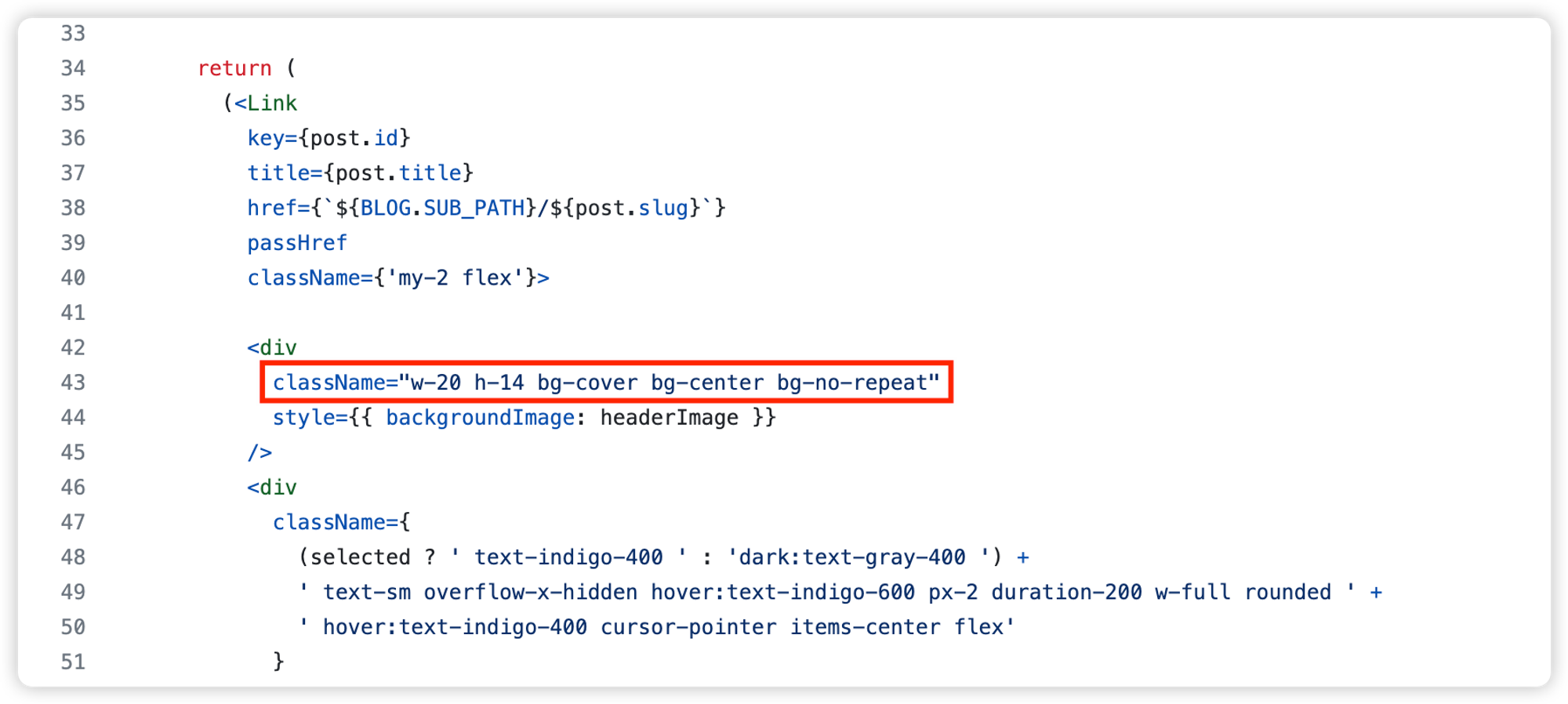
- 预览框的宽高可自行设置
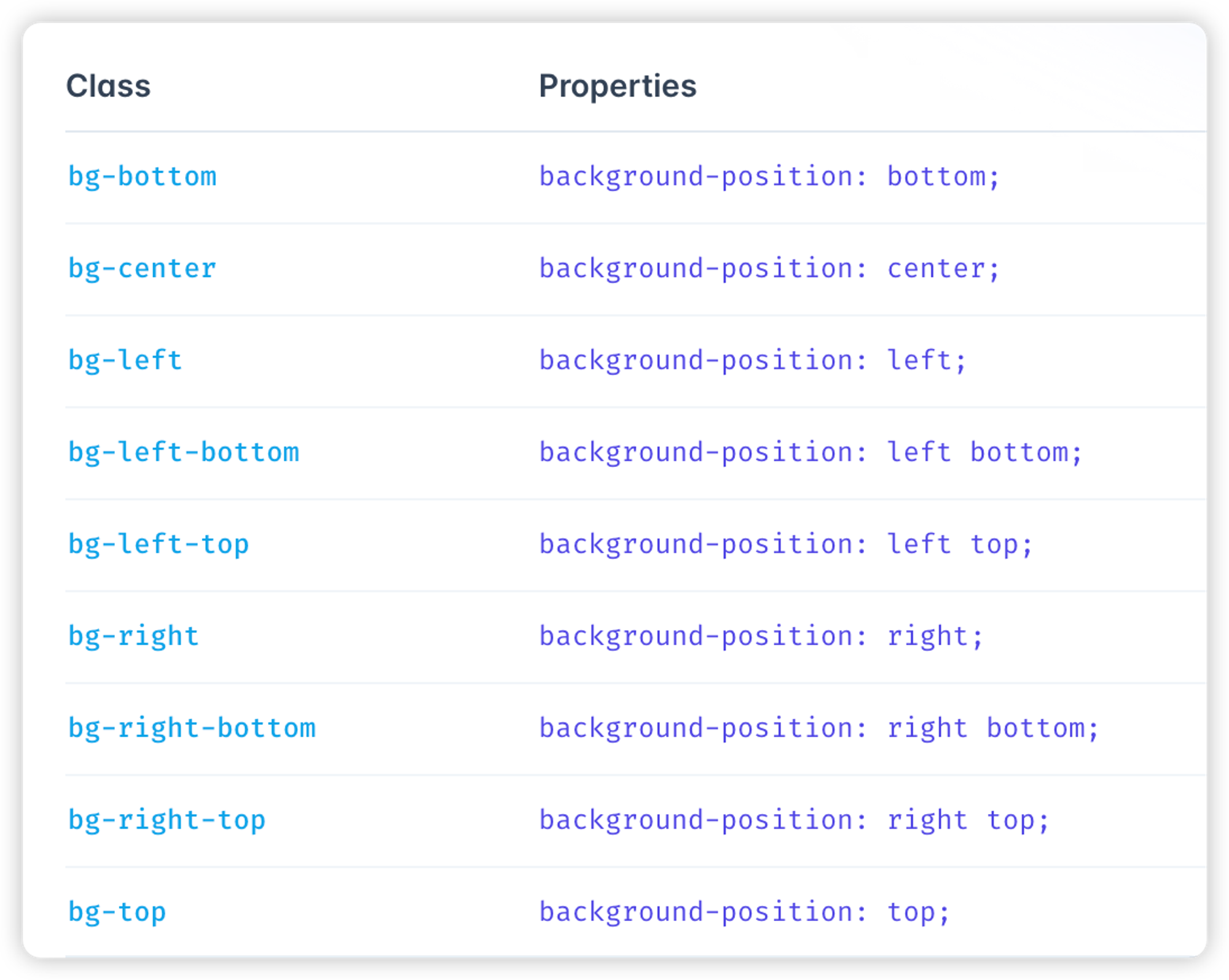
- 图片填充方式
fill: 默认值。内容拉伸填满整个content box, 不保证保持原有的比例。
contain: 保持原有尺寸比例。长度和高度中短的那条边跟容器大小一致,长的那条等比缩放,可能会有留白。
cover: 保持原有尺寸比例。宽度和高度中长的那条边跟容器大小一致,短的那条等比缩放。可能会有部分区域不可见。
- 图片位置

6、网站背景修改——自定义
文件路径:
/public/css/custom.css添加内容——背景网格线
/* 静态文件导入 自定义样式*/

#wrapper{
  width: 100%;
  height: 100%;
  background: linear-gradient(
      0deg,
      rgba(0, 0, 0, 0.1) 0px,
      rgba(0, 0, 0, 0.1) 1px,
      transparent 1px,
      transparent 100px
    ),
    linear-gradient(
      90deg,
      rgba(0, 0, 0, 0.1) 0px,
      rgba(0, 0, 0, 0.1) 1px,
      transparent 1px,
      transparent 100px
    );
  background-size: 25px 23px;
}

footer {
  background: linear-gradient(
    0deg,
    rgba(0, 0, 0, 0.1) 0px,
    rgba(0, 0, 0, 0.1) 1px,
    transparent 1px,
    transparent 100px
  ),
  linear-gradient(
    90deg,
    rgba(0, 0, 0, 0.1) 0px,
    rgba(0, 0, 0, 0.1) 1px,
    transparent 1px,
    transparent 100px
  );
  background-size: 25px 23px;
}


footer {
  background-color: rgba(0, 0, 0, 0); /* 设置背景颜色的透明度为 0,如果不生效可以去第7步页脚修改处修改 */
}
添加内容——纯色渐变效果
/* 静态文件导入 自定义样式*/
.mr-2.fas.fa-bullhorn{
    color: #f00;
}
/* 页脚footer渐变色滚动动画 */
@-webkit-keyframes Gradient {
    0% {
        background-position: 0 50%;
    }

    50% {
        background-position: 100% 50%;
    }

    100% {
        background-position: 0 50%;
    }
}

@-moz-keyframes Gradient {
    0% {
        background-position: 0 50%;
    }

    50% {
        background-position: 100% 50%;
    }

    100% {
        background-position: 0 50%;
    }
}

@keyframes Gradient {
    0% {
        background-position: 0 50%;
    }

    50% {
        background-position: 100% 50%;
    }

    100% {
        background-position: 0 50%;
    }
}
footer {
    background: linear-gradient(-45deg, #ee7752, #ce3e75, #23a6d5, #23d5ab);
    background-size: 400% 400%;
    -webkit-animation: Gradient 10s ease infinite;
    -moz-animation: Gradient 10s ease infinite;
    animation: Gradient 10s ease infinite;
    -o-user-select: none;
    -ms-user-select: none;
    -webkit-user-select: none;
    -moz-user-select: none;
    user-select: none;
    border-top-left-radius: 10px;
    border-top-right-radius: 10px;
}
footer:before {
    background-color: rgba(0, 0, 0, 0);
}
/* 首页黑夜霓虹灯 */
.text-4xl,
.text-lg,
#typed {
  animation: light_15px 10s linear infinite;
}
/* 关键帧描述 */
@keyframes light_15px {
  0% {
    text-shadow: #5636ed 0 0 15px;
  }
  12.5% {
    text-shadow: #11ee5e 0 0 15px;
  }
  25% {
    text-shadow: #f14747 0 0 15px;
  }
  37.5% {
    text-shadow: #f1a247 0 0 15px;
  }
  50% {
    text-shadow: #f1ee47 0 0 15px;
  }
  50% {
    text-shadow: #b347f1 0 0 15px;
  }
  62.5% {
    text-shadow: #002afa 0 0 15px;
  }
  75% {
    text-shadow: #ed709b 0 0 15px;
  }
  87.5% {
    text-shadow: #39c5bb 0 0 15px;
  }
  100% {
    text-shadow: #5636ed 0 0 15px;
  }
}

@keyframes light_10px {
  0% {
    text-shadow: #5636ed 0 0 10px;
  }
  12.5% {
    text-shadow: #11ee5e 0 0 10px;
  }
  25% {
    text-shadow: #f14747 0 0 10px;
  }
  37.5% {
    text-shadow: #f1a247 0 0 10px;
  }
  50% {
    text-shadow: #f1ee47 0 0 10px;
  }
  50% {
    text-shadow: #b347f1 0 0 10px;
  }
  62.5% {
    text-shadow: #002afa 0 0 10px;
  }
  75% {
    text-shadow: #ed709b 0 0 10px;
  }
  87.5% {
    text-shadow: #39c5bb 0 0 10px;
  }
  100% {
    text-shadow: #5636ed 0 0 10px;
  }
}
@keyframes light_5px {
  0% {
    text-shadow: #5636ed 0 0 5px;
  }
  12.5% {
    text-shadow: #11ee5e 0 0 5px;
  }
  25% {
    text-shadow: #f14747 0 0 5px;
  }
  37.5% {
    text-shadow: #f1a247 0 0 15px;
  }
  50% {
    text-shadow: #f1ee47 0 0 5px;
  }
  50% {
    text-shadow: #b347f1 0 0 5px;
  }
  62.5% {
    text-shadow: #002afa 0 0 5px;
  }
  75% {
    text-shadow: #ed709b 0 0 5px;
  }
  87.5% {
    text-shadow: #39c5bb 0 0 5px;
  }
  100% {
    text-shadow: #5636ed 0 0 5px;
  }
}
/*背景颜色渐变*/
/*
#wrapper{
  background: -webkit-linear-gradient(0deg, #ffd7e4 0%, #c8f1ff 100%)
}
*/
#wrapper{
  background: linear-gradient(
  100deg,
  hsl(229deg 100% 77%) 0%,
  hsl(239deg 93% 80%) 15%,
  hsl(251deg 85% 79%) 22%,
  hsl(262deg 77% 78%) 28%,
  hsl(273deg 69% 77%) 33%,
  hsl(285deg 61% 76%) 37%,
  hsl(297deg 54% 75%) 42%,
  hsl(308deg 58% 76%) 46%,
  hsl(318deg 67% 78%) 50%,
  hsl(325deg 76% 79%) 54%,
  hsl(331deg 83% 81%) 58%,
  hsl(337deg 89% 82%) 63%,
  hsl(342deg 94% 83%) 67%,
  hsl(347deg 98% 84%) 72%,
  hsl(352deg 100% 85%) 78%,
  hsl(357deg 100% 86%) 85%,
  hsl(2deg 100% 87%) 100%
  )}
.dark #wrapper{
  background: none;
}
/* 侧边栏个人信息卡片动态渐变色 */
.shadow-md{
  background: linear-gradient(
    -45deg,
    #e8d8b9,
    #eccec5,
    #a3e9eb,
    #bdbdf0,
    #eec1ea
  );
  position: relative;
  background-size: 400% 400%;
  -webkit-animation: Gradient 10s ease infinite;
  -moz-animation: Gradient 10s ease infinite;
  animation: Gradient 10s ease infinite !important;
}
@-webkit-keyframes Gradient {
  0% {
    background-position: 0% 50%;
  }
  50% {
    background-position: 100% 50%;
  }
  100% {
    background-position: 0% 50%;
  }
}
@-moz-keyframes Gradient {
  0% {
    background-position: 0% 50%;
  }
  50% {
    background-position: 100% 50%;
  }
  100% {
    background-position: 0% 50%;
  }
}
@keyframes Gradient {
  0% {
    background-position: 0% 50%;
  }
  50% {
    background-position: 100% 50%;
  }
  100% {
    background-position: 0% 50%;
  }
}
/* 黑夜模式适配 */
.dark .shadow-md {
  background:  #191919ee;
}
/* 公告卡片动态渐变色 */
#announcement-wrapper{
  background: linear-gradient(
    -45deg,
    #e8d8b9,
    #eccec5,
    #a3e9eb,
    #bdbdf0,
    #eec1ea
  );
  position: relative;
  background-size: 400% 400%;
  -webkit-animation: Gradient 10s ease infinite;
  -moz-animation: Gradient 10s ease infinite;
  animation: Gradient 10s ease infinite !important;
}
@-webkit-keyframes Gradient {
  0% {
    background-position: 0% 50%;
  }
  50% {
    background-position: 100% 50%;
  }
  100% {
    background-position: 0% 50%;
  }
}
@-moz-keyframes Gradient {
  0% {
    background-position: 0% 50%;
  }
  50% {
    background-position: 100% 50%;
  }
  100% {
    background-position: 0% 50%;
  }
}
@keyframes Gradient {
  0% {
    background-position: 0% 50%;
  }
  50% {
    background-position: 100% 50%;
  }
  100% {
    background-position: 0% 50%;
  }
}
/* 黑夜模式适配 */
.dark #announcement-wrapper {
  background:  #191919ee;
}
/* 头像呼吸灯 */
.light .rounded-full {
  animation: huxi_light 3s ease-in-out infinite;
}
.dark .rounded-full {
  animation: huxi_dark 3s ease-in-out infinite;
}
@keyframes huxi_dark {
  0% {
    box-shadow: 0px 0px 1px 1px #b7eaff;
  }
  50% {
    box-shadow: 0px 0px 5px 5px #f1c4f9;
  }
  100% {
    box-shadow: 0px 0px 1px 1px #ff5c5c;
  }
}
@keyframes huxi_light {
  0% {
    box-shadow: 0px 0px 1px 1px #e9f5fa;
  }
  50% {
    box-shadow: 0px 0px 5px 5px #e9f5fa;
  }
  100% {
    box-shadow: 0px 0px 1px 1px #e9f5fa;
  }
}
#theme-fukasawa .sideLeft hr{
    opacity: .04;
}
添加内容——几何图形及图形动画(旋转、呼吸、滑动等)
/* 静态文件导入 自定义样式*/

@keyframes rotateAnimation {
  0% {
    transform: rotate(0deg);
  }
  100% {
    transform: rotate(360deg);
  }
}

@keyframes breathAnimation { /* 呼吸动画 */
  0%, 100% {
    transform: scale(1);
  }
  50% {
    transform: scale(1.2);
  }
}

@keyframes slideAnimation {  /* 滑动动画1 */
  0%, 100% {
    bottom: 20%;
  }
  50% {
    bottom: 60%;
  }
}

@keyframes floatAnimation {  /* 滑动动画2,有点乱需要调整 */
  0%, 100% {
    top: 0%;
    left: 0%;
  }
  25% {
    top: 25%;
    left: 75%;
  }
  50% {
    top: 50%;
    left: 50%;
  }
  75% {
    top: 75%;
    left: 25%;
  }
}

body {
  margin: 0;
  height: 100vh;
}

#wrapper{
  width: 100%;
  height: 100%;
/*   background: linear-gradient(
      0deg,
      rgba(0, 0, 0, 0.1) 0px,
      rgba(0, 0, 0, 0.1) 1px,
      transparent 1px,
      transparent 100px
    ),
    linear-gradient(
      90deg,
      rgba(0, 0, 0, 0.1) 0px,
      rgba(0, 0, 0, 0.1) 1px,
      transparent 1px,
      transparent 100px
    ); */
  position: relative; /* 设置#wrapper相对定位,以便伪元素相对于它定位 */
  background-attachment: fixed !important;  /* 固定背景 */
/*   background-size: 25px 23px; */
}

#wrapper::before {
  content: "";
  position: fixed;
  bottom: 10%;
  left: -120px;
  width: 400px; /* 修改图形的大小为直径200px */
  height: 400px; /* 修改图形的大小为直径200px */
  background: rgba(234, 56, 77, 1); /* 设置图形的背景色 */
  border-radius: 50%; /* 将图形的角改为圆形 */
  animation: breathAnimation 15s infinite ease-in-out; /* 设置图形的呼吸动画,时长为3秒 */
  box-shadow: 0 0 10px rgba(234, 56, 77, 0.8); /* 设置阴影 */
}

#wrapper::after {
  content: "";
  position: fixed; /* 将伪元素固定定位,要配合wrapper的position: relative;使用;absolute为随内容滚动 */
  top: 15%;
  right: 17px;
  width: 100px; /* 设置图形的大小 */
  height: 100px; /* 设置图形的大小 */
  background: rgb(75,84,222);; /* 设置图形的背景色 */
  border-radius: 15px; /* 设置角为圆角 */
  animation: rotateAnimation 20s infinite linear; /* 设置图形的旋转动画 */
  transform-origin: center; /* 设置旋转的中心点为图形的中心 */
  box-shadow: 0 0 10px rgba(75,84,222, 0.8); /* 设置阴影 */
}

/* footer {
  background: linear-gradient(
    0deg,
    rgba(0, 0, 0, 0.1) 0px,
    rgba(0, 0, 0, 0.1) 1px,
    transparent 1px,
    transparent 100px
  ),
  linear-gradient(
    90deg,
    rgba(0, 0, 0, 0.1) 0px,
    rgba(0, 0, 0, 0.1) 1px,
    transparent 1px,
    transparent 100px
  );
  background-size: 25px 23px;
} */

footer {
  background-color: rgba(0, 0, 0, 0); /* 设置背景颜色的透明度为 0,如果不生效可以去第7步页脚修改处修改 */
}
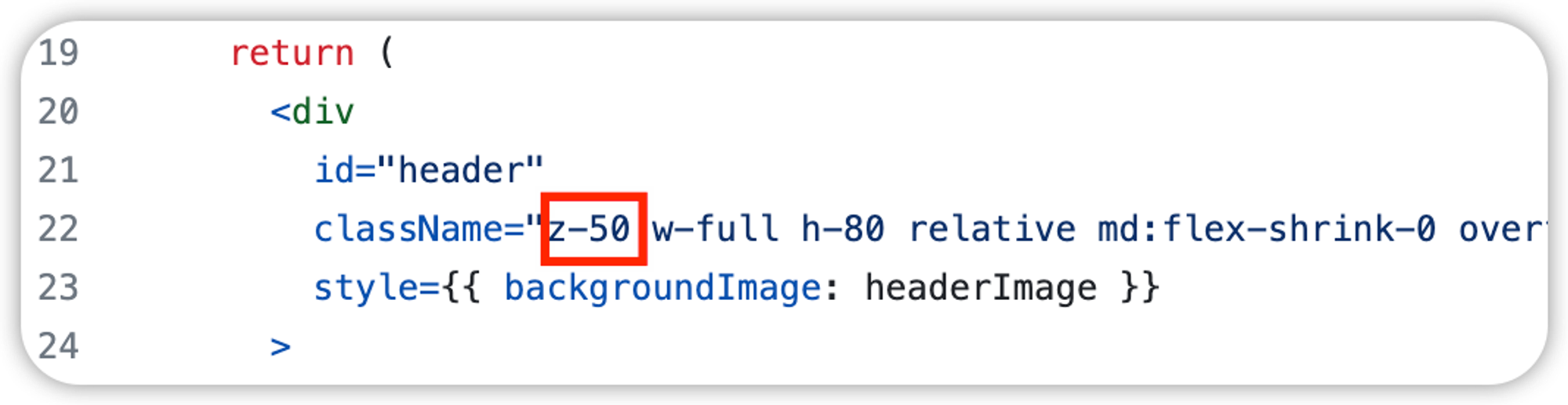
这里需要注意,几何图形可能会显示在文章页面header图的上方,所以还需要设置header图显示在最上层
修改路径:
themes/hexo/components/HeaderArticle.js在header对应的div里面添加z-50,空值元素堆叠

7、页脚相关修改
文件路径(hexo):
themes/hexo/components/Footer.js<footer className='relative z-10 dark:bg-black flex-shrink-0 bg-hexo-light-gray justify-center text-center m-auto w-full leading-6 text-gray-600 dark:text-gray-100 text-sm p-6' style={{ backgroundColor: 'rgba(0, 0, 0, 0)' }} // **********自定义添加**********将背景颜色设置为完全透明, > ... <i className='fas fa-users'/> <span className='px-1 busuanzi_value_site_uv'> </span> </span> <br/> // <h1>{title}</h1> // **********自定义修改**********不显示网站标题,在修改时建议直接删除,不注释 <span className='text-xs '>Powered by <a href='https://github.com/tangly1024/NotionNext' className='underline dark:text-gray-300'>NotionNext {BLOG.VERSION}</a>.</span></span><br/> </footer>
- className中的bg-hexo-light-gray:将背景颜色设置为hexo主题的灰色,可以将这个删除
- 设置透明色也可以在第【6、网站背景修改——自定义】中设置页脚透明
- <h1>{title}</h1>为页脚中的网站标题,可以删除,也可以删除或调整页脚中的其他内容
8、调整文章卡片的高度和背景
文件路径:
themes/hexo/components/BlogPostCard.js
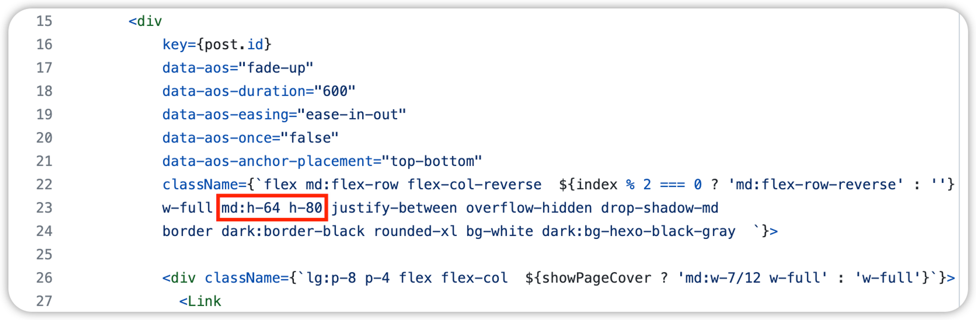
- 卡片高度:
- md断点,表示屏幕最小宽度768xp时生效,div高度设置为64;不带断点的h-80表示移动端的卡片高度 需要注意的是,高度值是有指定值的,如果不安指定值设置,则弹性容器的形状不会固定,会随内容的多少进行收缩或扩大
- 卡片背景:
- bg-white dark:bg-hexo-black-gray:白色背景(原)
- overflow-hidden(原)
- backdrop-blur-sm:模糊背景
- backdrop-opacity-10:透明度
9、设置固定背景图
文件路径:
/public/css/custom.css这个其实很简单,只需要在第6条中的wrapper上加一行代码就可以了
#wrapper{
  width: 100%;
  height: 100%;
  background: linear-gradient(
      0deg,
      rgba(0, 0, 0, 0.1) 0px,
      rgba(0, 0, 0, 0.1) 1px,
      transparent 1px,
      transparent 100px
    ),
    linear-gradient(
      90deg,
      rgba(0, 0, 0, 0.1) 0px,
      rgba(0, 0, 0, 0.1) 1px,
      transparent 1px,
      transparent 100px
    );
  background-attachment: fixed !important;  /* 固定背景 !important将该参数的设置优先级提到最高 */
  background-size: 25px 23px;
}
10、导航栏修改
文件位置:
themes/hexo/components/TopNav.js11、(全部主题)修改文章正常字体大小
不包含代码块,引用块等其他块级元素,如果想要修改其他块级元素则需要在 notion.css 文件中寻找相应的模块
文件位置:
styles/notion.css.notion { font-size: 17px; // 字体大小 line-height: 1.75; // 行高 color: var(--fg-color); caret-color: var(--fg-color); font-family: inherit; }
三、外部功能相关
3.1、博客美化相关
- Icon图标地址:https://fontawesome.com/v5/search
- 看板娘预览地址:
https://huaji8.top/post/live2d-plugin-2.0/(已失联)
- 我的网易歌单:https://music.163.com/outchain/player?type=0&id=7999195714&auto=1&height=430
- 20230606更新:有些歌单因为有收费歌曲,导致版权原因,无法分享歌单
- 最新解决办法:在网易云歌单(网页版)——检查——生成外联播放器——找到歌单id——将id复制到上面这个链接中;这样生成的嵌入嵌入链接就会自动排除收费歌曲,正常分享